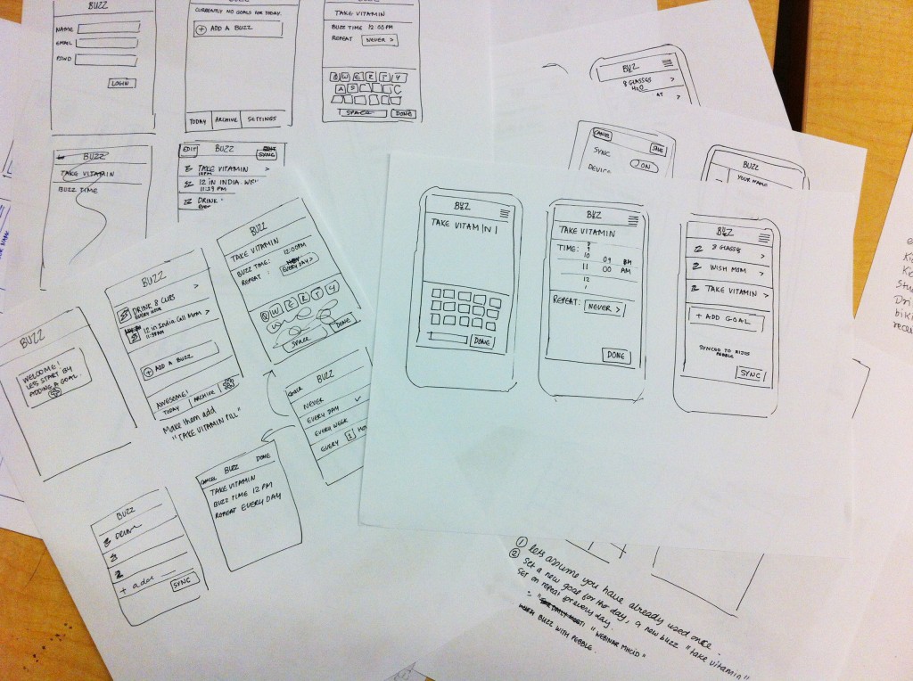
Rapid prototyping is nothing but submission of mock-up design (wireframes) about how a system should look and function upon full-fledged release. The system can be anything – a software, an app or a website. With rapid prototyping, stakeholders get a glimpse of what the fully ready design will look like and how it will behave. This will then undergo validation from leadership executive, developers, designers and other associated stakeholders.
The core purpose of this activity is to ensure that all perspectives are clearly factored in when doing actual development and thus save costs, time and effort in multiple iterations afterwards. When prototyping, you need to focus on the key/common functionality that will be used the most. Anything that is new, complex or routinely used functionality but needs security will definitely go through prototyping.
The process
The three key stages of rapid prototyping process include –
- Prototype – is the development of sketches or simulations that mock-up the actual solution
- Assess – this is then shared with key stakeholders for their review and feedback
- Revise – all feedback is incorporated into the prototype and made ready for further fine tuning
As more feedback keep getting added the prototype grows in scope and assumes a full-fledged pre-development design. The term ‘Rapid’ refers to the quick time in which the mock-up goes through a series of iterations to evolve into something concrete.
Fidelity in prototyping
Fidelity refers to the amount of effort/time involved to make prototype nearer to the actual product. So, low fidelity (wireframes) will be a rough pencil sketch far removed from the actual working system (more practical in the initial iterations), while high fidelity is as realistic to actual system as it gets – by use of high end simulator tools (this will be practical when all feedback has been collected and incorporated into the prototype).
Depending on the stage at which the development happens or the end objective of the prototype, fidelity can also encompass one or more of the below dimensions of fidelity –
1.Visual fidelity – This tackles the look and feel aspect of prototyping. It can range from rough pencil sketches of the mock-up to hi-fi stylized versions. More focus should be on the UI aspect here.
Juicy Tip – Don’t go high end in the first stage itself as the mock up is bound to take shape and evolve further post gathering feedback from stakeholders. As the process progresses, you can bring in individual elements such as color, graphics, high-res images etc.
2. Content fidelity – This tackles the way content placement will affect the overall look of the application or website.
Juicy Tip – Start off by placing dummy text (“Lorem ipsum…”) into the rough sketches just to fill up the blank space on layout. As the design keeps getting better you can replace this with actual content to gauge its impact.
3. Behavioral fidelity – This dimension shows whether the prototype will be static or dynamic / interactive when presented to stakeholders.
Juicy Tip – Initially, keep interactivity to the minimum as focus should be on layout and visual appeal. Later on you can add elements of interactivity to make the behaviors as similar to actual system as possible. This way the subsequent iterations can be utilized for usability testing and user experience.
GoodWorkLabs specialises in User Experience (UX) for software products, mobile apps, games and enterprise products. Request for a free quote for your UX, prototyping and design needs.


